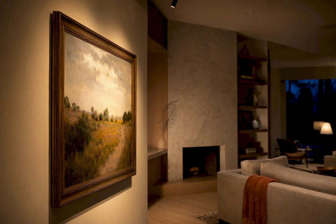
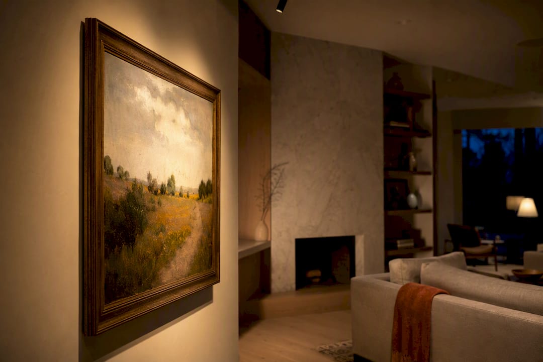
The most reliable way to light art is layered lighting paired with targeted accenting. Aim the accent light at roughly a 30 degree angle from the wall, choose bulbs with a CRI of 90 or higher, and pick a color temperature between 2700K and 3500K depending on the artwork's style. Track heads, picture lights, and recessed fixtures all handle this job well. Get those four things right, and almost any piece looks like it belongs in a gallery.
TL;DR:
- Proper art lighting relies on layered, targeted accenting with bulbs that have a CRI of 90 or higher and a color temperature between 2700K and 3500K.
- Using adjustable track lighting or picture lights offers flexibility and a clean look for different art pieces, with placement aiming for a 30 degree angle from the wall.
- Achieving accurate color rendering depends equally on high-CRI bulbs and correct placement, avoiding common mistakes like even ceiling grids or low-CRI bulbs.
- Sculptures require multiple light sources at different angles to emphasize their three-dimensional form and material reflections.
- Protect artwork from damage by choosing fixtures with heat sinking, avoiding direct sunlight, and limiting UV exposure through proper glazing or filters.
Table of Contents
- Art Lighting Ideas That Actually Work in Real Rooms
- Choosing Fixtures and Bulbs That Render Art Accurately
- Placement and Mounting: Getting the Angle Right
- Layering Light So Art Holds the Room
- Protecting Your Art From Light and Heat Damage
- Installation Options and What They Actually Cost
- A Room Recipe and Three Quick Diagnostics
- Lighting Sculptures and Other Three-Dimensional Art
- Adjusting Light for Different Materials and Textures
- Mistakes That Quietly Ruin an Otherwise Good Setup
- Why Subtlety Wins in Home Art Lighting
- Where to Find Curated Lighting Picks for Your Walls
- Sources
Art Lighting Ideas That Actually Work in Real Rooms
Good art lighting rarely comes from a single fixture. It comes from picking the right tool for the piece, the wall, and the room's existing light. Here are the ideas that hold up once you actually live with them.
- Gallery track lighting for rotating collections. A single track with two or three adjustable heads lets you re-aim light every time you swap art, which makes it the most flexible option for anyone who redecorates often.
- Hardwired picture lights for a single treasured piece. These mount directly above the frame and wire into a switch or dimmer, giving a clean, permanent look for a painting you never plan to move.
- Rechargeable picture lights for renters. Battery-powered LED bars clip onto the frame with no wiring and no wall damage, and most run for weeks between charges.
- Adjustable recessed or eyeball fixtures for a subtler overhead accent. These sit flush in the ceiling and tilt to hit the piece without announcing themselves as "art lights."
- Wall washers and grazing lights for textured art and murals. Grazing light across a rough surface at a low angle exaggerates brushwork and texture instead of flattening it.
- Backlit frames and integrated LED shelving for contemporary or graphic pieces. A thin LED strip behind a floating shelf or shadow box frame gives modern art a glow instead of a spotlight.
- Cluster and salon-wall lighting for grouped art. Space accent beams so they slightly overlap, and vary intensity across the group so your eye still finds a focal piece instead of a wall of equal brightness.
- Smart bulbs and saved scenes for mixed-media walls. A dimmable smart bulb in a track head lets you save a "daytime" and "evening" scene, useful when a wall mixes photography, oil paintings, and a mirror.
- Low-ceiling adaptations for older homes. Surface-mounted mini spotlights or slim LED pucks work where there is no room for recessed housings.
- Deep-frame fixes for heavy antique frames. Mount the light farther from the wall than usual so the top rail of the frame doesn't cast a shadow across the canvas.
- Quick upgrades for almost any setup. Swapping a standard bulb for a high-CRI LED, or simply repositioning an existing lamp head a few inches, often solves more of the problem than people expect before you spend a dime on new hardware.
Notice what's missing from that list: a grid of evenly spaced ceiling downlights hitting every square foot of wall equally. Professional lighting guidance from Christie's treats a room more like a stage, lighting key focal points on purpose rather than flooding the whole space. That single shift, from even coverage to selective emphasis, is what separates a room that looks lit from a room that looks curated.
Choosing Fixtures and Bulbs That Render Art Accurately
Color temperature and CRI decide whether your art looks true or slightly wrong, even when the room "looks fine" at first glance.
Kelvin guidance is straightforward once you know the style you're lighting. Warm, traditional oil paintings and antique frames generally look richer under 2700K to 3000K light, which flatters warm pigments and gilded frames. Modern, high-contrast, or black-and-white pieces tend to hold their punch better under 3000K to 3500K, a slightly cooler and crisper light. Our full breakdown of 2700K versus 3000K walks through how that half-step of warmth changes a room.
CRI matters just as much as Kelvin, and it gets ignored far more often. A bulb with a CRI below 90 can wash out reds or mute greens, even at the "right" color temperature. Look for CRI 90 or higher on the packaging, not just the Kelvin number.
Before buying, confirm:
- CRI rating printed on the box or spec sheet (90+, ideally 95+ for fine art)
- Beam angle appropriate to the piece: narrow spots (around 15 to 25 degrees) for small or single works, wider floods (35 degrees or more) for large canvases or clusters
- Integrated heat sinking on the fixture, since a poorly designed LED housing can build up heat behind the frame over time
- A manufacturer warranty, which usually signals better thermal design and more consistent color output over years of use
Pro Tip: Buy one bulb before committing to a whole track's worth. Live with it above the artwork for a few evenings before deciding the color temperature is right, since store lighting and home lighting almost never match.
Placement and Mounting: Getting the Angle Right
The 30 degree rule is the single most useful number in this whole topic. Aim the light so it hits the center of the artwork at roughly 30 degrees from the wall. Any steeper and you get glare bouncing back at the viewer; any shallower and the beam grazes the top of the frame without properly lighting the piece.
Here's a simple way to apply it:
- Measure the distance from the floor to the center of the artwork.
- Mount the fixture at a height and distance from the wall so the beam falls at that same 30 degree angle onto the center point.
- Check for glare by standing where you'd normally view the piece; if you see a hot reflection off glass or varnish, nudge the angle slightly.
- For deep or ornate frames, move the fixture farther from the wall than you would for a flat canvas so the top rail doesn't throw a shadow across the image.
- In hallways and stairwells, favor multiple smaller fixtures over one bright one, since a single strong light in a narrow space tends to create harsh contrast between lit and unlit walls.
Centerline height typically lands close to standard eye level, around 57 to 60 inches to the middle of the piece, though a staircase or an unusually tall wall may call for adjusting that up or down.
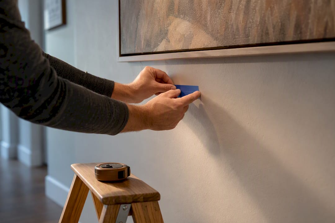
Pro Tip: Use painter's tape to mark your intended beam center on the wall before drilling anything. It takes thirty seconds and saves you from a permanently misaligned fixture.
Layering Light So Art Holds the Room
Layered lighting means combining three roles: ambient light that fills the room generally, accent light that targets the art specifically, and task light for reading or working. The trick is balance. Accent light should read as noticeably brighter than the art's surroundings, without dropping the rest of the room into gloom.
A few ways this plays out:
- In a living room, dim the ambient ceiling light and let a single picture light or track head become the brightest point in the room. The painting becomes the anchor everyone's eye lands on first.
- In a hallway gallery, keep ambient light low and let each accent do the work, spaced evenly so the walk feels intentional rather than patchy.
- For bedside art, a small adjustable sconce aimed at the piece, paired with a warm dimmed lamp, keeps the room calm instead of clinical.
Smart dimmers make this easier to live with day to day, letting you drop accent intensity in the evening to protect the art and shift the mood, all from one saved scene. Our guide to why living room lighting often feels off digs deeper into this ambient-versus-accent balance.
Protecting Your Art From Light and Heat Damage
Light damage is cumulative and mostly invisible until it isn't. UV exposure fades pigments and yellows paper over years, and even LEDs, which emit far less UV than older bulb types, can still generate enough heat behind a poorly built fixture to stress a frame or canvas over time.
A few safeguards worth building into any setup:
- Choose fixtures with integrated heat sinking rather than bargain battery lights with no thermal design
- Keep art out of direct sunlight, and use UV-filtering window film or glazing on pieces near windows
- Follow the exposure-limiting principles conservation resources like CCAHA outline for anything you consider irreplaceable
- Consult a professional conservator before lighting antique textiles, works on paper, or anything with fugitive pigments
Installation Options and What They Actually Cost
You don't need a contractor to see a real improvement. A complete home gallery lighting system, from simple bulb swaps up to full rail installations, can often be assembled for under $1,000, and plenty of upgrades cost far less than that.
- No-installation, low-cost: swapping in a high-CRI bulb, repositioning an existing floor lamp, or clipping on a rechargeable picture light. Often near zero added cost beyond the bulb itself.
- Mid-range: plug-in picture lights, a short track segment with two or three heads, or a professional-grade rechargeable fixture built for longer battery life and better color output.
- High-end: hardwired picture lights wired into a dedicated switch, a full track or rail system across a gallery wall, and professional installation with integrated dimming.
If you're weighing a media wall alongside your art wall, this rundown of media wall lighting installation approaches is worth a look before you commit to one system for both.
A Room Recipe and Three Quick Diagnostics
For a warm modern living room, we typically recommend a two-circuit track with adjustable heads at 3000K, CRI 95, dimmed to roughly 70 percent for the art and 30 percent for ambient fill in the evening. Our full Room Recipe for a warm modern living room walks through the exact fixture mix.
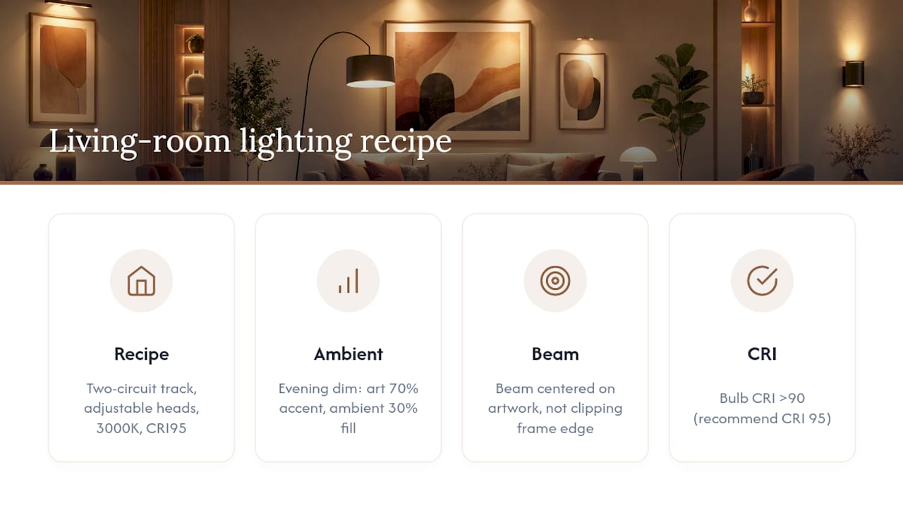
If a piece still doesn't look right, check three things: is the ambient light too close in brightness to the accent, is the beam actually centered on the piece rather than clipping the frame's edge, and is the bulb's CRI actually above 90. Our beginner's guide to layered lighting covers each of these in more depth.
Lighting Sculptures and Other Three-Dimensional Art
Flat artwork only needs light from one direction. Sculpture needs light from several, because a single beam on a three-dimensional piece creates hard shadows on one side and leaves the other side flat and dark.
For sculptures, use at least two light sources at different angles rather than one strong spot. A primary accent from above at roughly 30 to 45 degrees establishes the main form, while a secondary, dimmer fill light from the opposite side softens shadows without erasing them entirely. Shadows aren't the enemy here. They're what makes a sculpture read as dimensional instead of silhouetted.
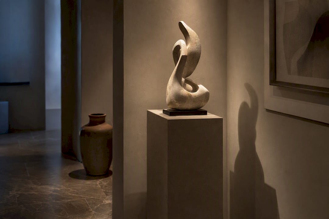
Material matters more with sculpture than with paintings. Glossy bronze or polished stone reflects light directly back at the viewer, so a narrow spot can create a distracting hot spot on the surface rather than an even glow. A wider, softer beam usually reads better on reflective materials. Matte materials like unglazed ceramic or raw wood tolerate a narrower, more direct spot without the same glare risk.
Placement also matters if the piece is viewed from multiple sides, which most sculpture is. A pedestal piece meant to be walked around needs light that doesn't create a completely dark side no matter where the viewer stands, which usually means accepting a slightly less dramatic look in exchange for a piece that reads well from every angle.
Adjusting Light for Different Materials and Textures
A flat oil painting and a heavily textured mixed-media piece need different light almost as much as a painting and a sculpture do. Surface finish changes how light behaves once it hits the piece, so the "right" setup depends on what the art is actually made of.
Glossy surfaces, including varnished oil paintings and glass-covered prints, are prone to glare. A light positioned too close to that 30 degree angle head-on can throw a bright reflection straight back at the viewer's eyes. Shifting the angle slightly steeper, or widening the beam so no single point is overwhelmingly bright, usually solves it.
Textured surfaces, like heavy impasto paintings, woven textiles, or plaster reliefs, benefit from the opposite approach. A low, raking angle across the surface, sometimes called grazing light, catches every ridge and brushstroke and throws small shadows that reveal the texture. Light the same piece head-on and all that dimension disappears into a flat, uniform surface.
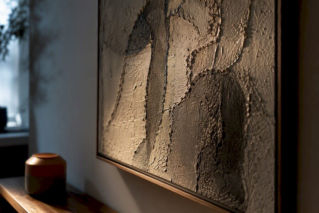
Matte and paper-based works, including watercolors and unframed prints, are the most forgiving of the group but the most vulnerable to UV damage, since they lack the varnish layer that protects an oil painting's pigment. These deserve the most conservative light levels and the least direct sun exposure of anything on your walls.
Mistakes That Quietly Ruin an Otherwise Good Setup
Most art lighting problems come from a small number of repeat mistakes, not from expensive equipment failures.
The most common one is gridding the ceiling with evenly spaced downlights instead of aiming light at specific pieces. It's an easy default during a renovation, but it produces a flat, shadowless room where nothing stands out, which runs directly against the selective, stage-like approach that actually makes art pop.
The second is ignoring frame depth. A light mounted at the standard distance for a flat canvas will cast a shadow across the top third of a deep, ornate frame, and most people never trace the problem back to that mismatch.
The third is chasing a flattering Kelvin number while ignoring CRI. A bulb can hit exactly 3000K and still render colors poorly if its CRI sits in the 70s or 80s, which is common in cheaper bulbs sold purely on their color temperature label.
The fourth is treating battery-powered lights as a permanent solution without checking their thermal design, which risks slow heat damage to a frame over years of continuous use. And the fifth is simply under-lighting the accent relative to the ambient light, so the art gets a token beam instead of the visual priority it needs to actually hold the wall.
Why Subtlety Wins in Home Art Lighting
Change one thing at a time. Swap the bulb, then live with it a week before touching the angle. Swap the ambient dimmer level next. The goal isn't a dramatic new light fixture people notice. It's light that disappears entirely, leaving only the art looking better than it did the week before. If you want the deeper mechanics behind that balance, our layered lighting guide is a good next stop.
— August
Where to Find Curated Lighting Picks for Your Walls
This site is a shortcut for readers who don't want to comparison-shop fixtures for a week before mounting a single picture light. Instead of sorting through generic marketplace listings with no context on Kelvin, CRI, or beam angle, you get curated picks already filtered for the specs that actually matter for art.

The lighting hub organizes recommendations by fixture type and use case, so you can jump straight to picture lights, track systems, or smart bulbs without wading through unrelated inventory. If you're still working out the fundamentals of ambient versus accent, The Beginner's Guide to Layered Lighting breaks the whole approach down room by room. Start there, pick one wall in your home, and see how it looks after a single fixture change.
Sources
- Art lighting masterclass: complete guide — Austin Gallery
- How to light your artworks — Christie's
- Light exposure and artifacts — CC-AHA resources