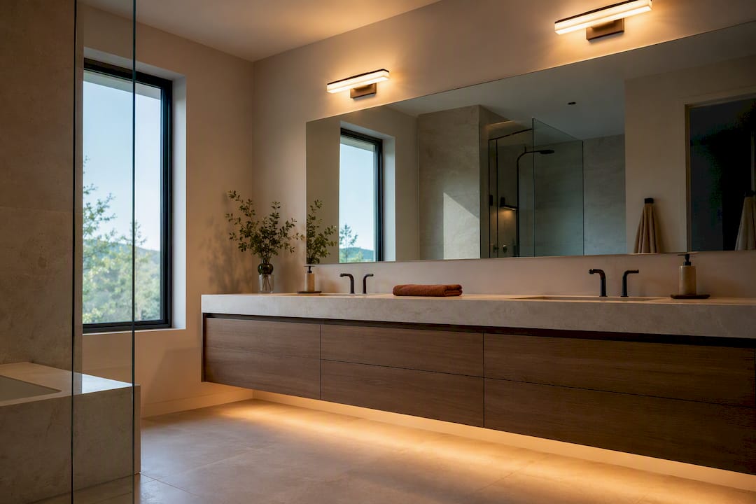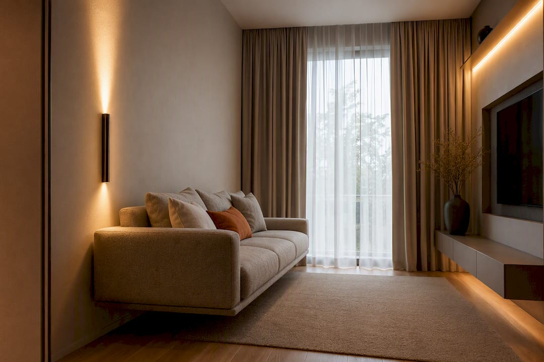

Use 3000K for spaces where you want to unwind, like living rooms, bedrooms, and dining areas, and 4000K where you need clarity and focus, like kitchens, bathrooms, and home offices. Both temperatures are correct. The only question is what a room is asking you to do in it. Check lumens and CRI on the package too, since those numbers shape brightness and color accuracy as much as Kelvin does.
TL;DR:
- Choosing between 3000K and 4000K depends on room purpose, with softer 3000K suited for relaxation areas and 4000K for task-focused or high-clarity spaces.
- Lumens better reflect actual brightness than watts, and a CRI of 90+ is essential for accurate color rendering in makeup, food, or artwork areas.
- Avoid mixing 3000K and 4000K bulbs in the same fixture or open space to prevent visual clash; instead, use gradual Kelvin transitions in connected rooms.
- Prioritize room functions over conventional aesthetics; check the Lighting Facts label for lumen output, CRI, and energy costs before selecting bulbs.
- Material and fixture placement influence how light interacts with a space, so test samples in place to ensure color accuracy and proper ambiance.
Table of Contents
- 3000K or 4000K? Quick Picks by Room
- How Kelvin, Lumens, and CRI Actually Work Together
- Room-by-Room Lighting Recommendations
- Rules for Mixing 3000K and 4000K Without It Looking Off
- What to Check Before You Buy Bulbs or Fixtures
- Designer-Level Details That Change How a Room Reads
- Our Take: Pick Function First, Not Whichever Bulb Looks Nicer in the Store
- Where to Go Next for Layered, Room-Ready Lighting Plans
- Sources
3000K or 4000K? Quick Picks by Room
You don't need a lighting degree to make this call correctly. Here's the short version, room by room, so you can shop with confidence instead of guessing at the hardware store.
- Living room: 3000K, warm and easy to relax into
- Bedroom: 3000K, or even 2700K near the bed for wind-down light
- Dining room: 3000K, flattering for skin tones and food
- Kitchen: 4000K over counters and the stove, 3000K is fine for a breakfast nook or island pendant
- Bathroom: 3500K to 4000K at the vanity, especially with CRI 90+ for makeup and grooming
- Home office: 4000K to support focus during work hours
- Garage: 4000K for visibility on tools and small parts
- Outdoor/entry: 3000K for porches and entries, 4000K for driveways and security zones
The exceptions matter. Vanity mirrors and artwork often benefit from higher CRI regardless of Kelvin, since color accuracy depends on both. Open-plan areas need a different strategy entirely, which we'll get to in the mixing section below. When a room genuinely serves two purposes, like a kitchen that opens into a family room, layered lighting lets you use both temperatures without a clash.
How Kelvin, Lumens, and CRI Actually Work Together
Kelvin measures color, not brightness. A bulb labeled 3000K reads as warm and golden, similar to early evening sun. A 4000K bulb reads neutral and crisp, closer to daylight through an office window. Neither is "brighter" by default, but 4000K often looks brighter at the same lumen count because cooler light reads as more energetic to the eye.
Lumens are the actual brightness measurement, and they matter more than watts ever did once LEDs took over. Watts measured how much electricity an old incandescent bulb burned to produce light. LEDs produce far more light per watt, so a 9 watt LED can output as many lumens as a 60 watt incandescent once did. Shop by lumens, not by the watt number you remember from childhood.
Quick reference:
- Kelvin = color temperature (warm to cool)
- Lumens = actual brightness
- Watts = power draw, not a brightness measure
- CRI = how accurately a light renders color, on a scale to 100
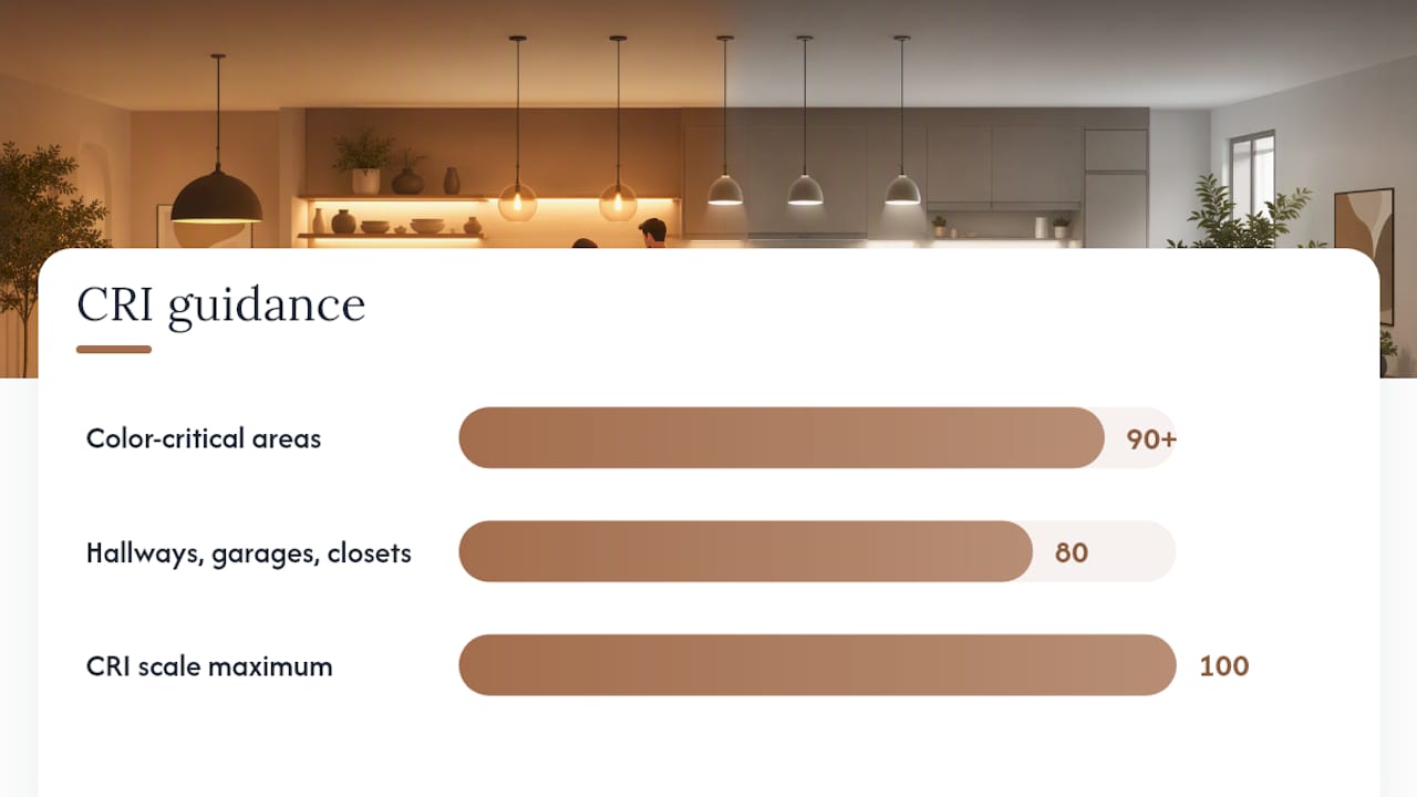
CRI deserves more attention than most shoppers give it. A bulb can hit the right Kelvin and still make your skin, food, or artwork look slightly off if the CRI is low. Anywhere color accuracy counts, a bathroom vanity, a kitchen counter, a closet you use to pick outfits, look for CRI 90 or higher. CRI 80 is acceptable for hallways, garages, and closets where you're not scrutinizing color.
Room-by-Room Lighting Recommendations
Getting the Kelvin right in each room comes down to matching light to what you actually do there, not to some universal rule about what looks nice.
1. Living room and bedroom. These are recovery spaces. 3000K creates the kind of low-key glow that makes it easier to sit down and stop performing. Layer it: overhead ambient light on a dimmer, a floor lamp for reading, and a smaller accent light near art or a shelf. If you watch TV in the living room, keep ambient light dim and indirect so it doesn't wash out the screen. Bedrooms benefit from the same logic, plus a case for going even warmer near the bed, since cooler light suppresses melatonin and delays sleep onset more than warm light does.
2. Kitchen and bathroom. These are task rooms first, mood rooms second. 4000K over a kitchen counter or stove makes it easier to tell if chicken is actually cooked through or if you missed a spot chopping onions. Bathrooms need the same clarity at the vanity, ideally 3500K to 4000K with CRI 90+, so what you see in the mirror matches what you'll see in daylight. A dim, warm bathroom bulb might feel cozy at 11pm, but it's a bad reason to leave the house looking like you forgot to finish your makeup.
3. Home office and workshop. 4000K supports the kind of alert focus you want at a desk or workbench. Aim for enough lumens to avoid squinting at fine print or small parts, roughly 30 to 40 lumens per square foot for general office use, higher directly over a workbench. Watch glare on monitors: position overhead fixtures so they don't bounce straight into your eyes or reflect off the screen.
4. Garage and outdoor. Garages want 4000K for visibility on tools and stains you'd otherwise miss. Outdoor lighting is more nuanced: entries and porches feel more welcoming at 3000K, while driveways and security areas benefit from 4000K's sharper contrast. If you're near a dark-sky-conscious neighborhood, shield fixtures downward regardless of Kelvin, since glare and light spill matter more than temperature there.
5. Open-plan spaces. Don't fight the openness by mixing Kelvin wildly across one sightline. Keep temperature consistent and use brightness and layering, not color shifts, to define zones. A kitchen island pendant can run slightly brighter than the surrounding living area without changing Kelvin at all.
Pro Tip: If you're only changing one room this year, start with the kitchen. It's the room where the wrong Kelvin causes the most daily friction, from gray-looking food to squinting at recipes.
Rules for Mixing 3000K and 4000K Without It Looking Off
The core rule is simple: one color temperature per room. Mixing 3000K and 4000K bulbs in the same fixture or the same open space creates a visual clash your eye picks up on even if you can't name what's wrong.
Where rooms connect, especially in open-plan homes, use a gradual shift instead of a hard cut. A sequence like 2700K in the living room, stepping up to 3000K in a hallway, then 3500K in the kitchen, reads as intentional rather than accidental. Your eye adjusts gradually instead of noticing a jarring jump at the doorway.
- Never mix 3000K and 4000K bulbs in the same fixture or ceiling run
- Shift Kelvin gradually across connected spaces, not abruptly
- Use ambient, task, and accent layers to combine temperatures purposefully within one room
- Consider layered lighting as your framework for combining a warm ambient wash with a cooler task light
CCT-selectable fixtures solve a lot of this indecision. Many now let you pick 2700K, 3000K, 3500K, or 4000K at installation, and some offer warm-dim behavior that shifts warmer as you dim, mimicking how incandescent bulbs used to behave.
What to Check Before You Buy Bulbs or Fixtures
The Lighting Facts label on every bulb box tells you more than the Kelvin number alone. It lists lumens (actual brightness), estimated yearly energy cost, expected bulb life, and light appearance on a visual scale from warm to cool. Read it before you check the price.
To figure out how much light a room actually needs, use square footage and a lumens-per-square-foot target rather than guessing. Bedrooms and living rooms typically run 10 to 20 lumens per square foot, general kitchen lighting closer to 30 to 40, and task areas like a kitchen counter or workbench 50 or higher. A lumens-to-watts calculation can help you translate that target into an actual bulb purchase.
- Confirm the bulb is dimmable if you plan to use a dimmer switch, and check dimmer compatibility both ways
- Watch for warm-dim behavior versus fixed CCT bulbs that stay the same color at every brightness level
- Consider CCT-selectable fixtures if you're renovating and want flexibility without rewiring later
- Match CRI to the room's purpose: 90+ for vanities and kitchens, 80 is fine elsewhere
Pro Tip: Buy one bulb before you buy a case. Screw it in, live with it for two nights, then decide. Lighting that looks right on a showroom shelf can read completely differently once it's over your own countertops.
Designer-Level Details That Change How a Room Reads
Material matters as much as Kelvin. Warm wood tones, terra cotta paints, and natural textiles look richer under 3000K, while the same materials can look slightly flat or muddy under 4000K. Cooler light tends to favor modern palettes: white oak, matte black hardware, and cool-toned stone. If you're choosing interior door finishes or trim colors, test them under the bulb you're actually installing, not the store's fluorescent overheads.

Placement matters too. Aim fixtures at surfaces, walls, counters, art, rather than letting them shine directly into eye level, and avoid pointing anything at a mirror or glossy backsplash where it'll bounce back as glare. Before committing to a whole room, test a sample bulb in place for a few evenings and note the exact CCT you land on somewhere you'll remember it. A phone photo of the fixture's label saves you from mismatched replacements years later, when the box in the closet says nothing and the bulb has long since burned out.
Our Take: Pick Function First, Not Whichever Bulb Looks Nicer in the Store
Neither 3000K nor 4000K wins as a universal answer, and most lighting guides undersell how much that depends on what's actually in the room. A living room full of warm wood and linen will always look better under 3000K. The same square footage with white oak floors and matte black fixtures can carry 3500K just fine. Function comes first, materials come second, and personal taste comes last, in that order.
Where conventional advice falls short is treating Kelvin as the whole decision. Lumens and CRI do as much work as color temperature, and skipping them is how people end up with a "warm" bulb that still looks dim and lifeless, or a "bright" bathroom light that makes skin tones look gray. If you take one thing from this, check the Lighting Facts label before you check the Kelvin number.
Start with the room that bothers you most every single day. For most homes, that's the kitchen or the bathroom vanity, not the living room everyone obsesses over first.
— August
Where to Go Next for Layered, Room-Ready Lighting Plans
Getting the Kelvin right is half the job. The other half is layering ambient, task, and accent light so a room doesn't just have the correct color temperature, it actually feels finished. That's the gap Theconnecteddwelling exists to close: practical, room-specific guidance instead of generic bulb-buying advice that ignores what your space is actually for.

If this article solved your Kelvin question, the next one to read is our full lighting guide, where you'll find curated bulb and fixture picks organized by room, plus deeper dives like why your living room lighting probably feels wrong even after you've swapped bulbs. If you're weighing dimmers or smart controls to manage warm-dim behavior across a whole house, our comparison of smart bulbs versus smart switches walks through which approach fits your setup. Start with the lighting hub, bookmark the room guide closest to your current project, and go fix the one light that's been bothering you.
Sources
- Shopping for light bulbs | FTC
- What color light helps you sleep? | Sleep Foundation
- Lumens-to-watts calculator | LumenCalculator
- Colour temperature guide | Maple Electric Supply
- 3000K vs 4000K: Choosing the right white light for every room | Amicolight