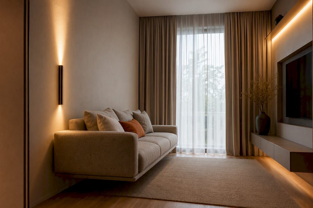
Warm colors can make a room feel inviting almost instantly. A little clay, walnut, camel, cream, or rust can take a space that feels flat and give it a sense of comfort and depth.
But there’s a line.
Add too much warmth—or too many warm colors at the same intensity—and suddenly the room can start to feel dark, yellow, brown, or just a little too heavy.
The trick isn’t avoiding warm colors. It’s giving them enough contrast, texture, and light to breathe.
And that’s really the theme here: a good warm palette is less about finding the perfect beige and more about creating relationships between color, material, and light.
What Actually Counts as a Warm Color?
When we talk about warm colors, the obvious examples are reds, oranges, and yellows. But most of us probably aren’t planning a living room around bright orange walls.
In an actual home, warmth is usually much more subtle.
Think:
- Cream and warm white
- Sand and oatmeal
- Camel and cognac
- Terracotta and clay
- Ochre and tobacco
- Walnut and other rich woods
- Mushroom and warm taupe
- Dusty blush and muted rust
Even some grays and greens can feel warm depending on what surrounds them.
That last part is important because color is always relative.
A mushroom gray might look warm next to a blue-gray sofa but surprisingly cool next to honey-colored oak. A creamy white that looks beautiful in one house might suddenly look yellow when you put it next to a certain countertop.
It’s one of the reasons I wouldn’t put too much faith in paint names.
“Warm Linen,” “Natural Cream,” and “Soft Sand” sound lovely on a paint chip, but the undertone is what actually matters once the color is on your wall.
Pay more attention to undertones than names
If you’ve ever brought home five beige samples and wondered how they could possibly look that different from one another, undertones are usually the reason.
One beige might lean pink.
Another might have a noticeable yellow cast.
Another could have a touch of green or gray.
You may barely notice the difference on a small paint card, but cover an entire wall with it and those undertones suddenly become much easier to see.
Instead of choosing a color in isolation, compare it directly against the things that aren’t going anywhere:
- Flooring
- Stone
- Cabinetry
- Large furniture
- Wood tones
- Countertops
- Existing trim
Ideally, the undertone of your wall color should have some sort of relationship with at least a couple of those elements.
It doesn’t have to match them. In fact, I’d rather it didn’t.
It just needs to look like everything belongs in the same conversation.
The Best Warm Rooms Aren’t All Warm
This might sound backwards, but one of the easiest ways to make warm colors look better is to give them something cooler to sit next to.
Imagine a room with cream walls, a tan rug, a cognac leather sofa, oak furniture, brass lighting, rust pillows, and warm 2700K bulbs.
None of those things are necessarily bad on their own.
Together, though, everything starts pulling in exactly the same direction.
Your eye never gets a break.
Now imagine introducing a dusty blue chair, some cooler stone, a soft sage textile, a charcoal detail, or even a piece of artwork containing blue-gray.
Suddenly all of those warm materials feel warmer—in a good way—because they have some contrast.
You don’t need a 50/50 mix of warm and cool colors. Sometimes one or two cooler notes are enough.
Think of them as visual breathing room.
Build Depth With Light, Medium, and Dark Values
One of the easiest mistakes to make with a warm palette is trying to create richness simply by making everything darker.
You don’t need to.
Depth usually comes from variation, not darkness.
I like to think about a room as having three general levels:
Light: walls, curtains, ceilings, rugs, or upholstery that keep the room open.
Medium: wood furniture, leather, textiles, cabinetry, and the colors that give the room most of its personality.
Dark: smaller grounding elements such as a coffee table, lamp, fireplace surround, built-ins, frames, or darker accents.
You don’t need equal amounts of all three.
In fact, you probably shouldn’t have equal amounts.
The lighter colors create space. The medium tones create character. The darker colors give your eye places to land.
Give dark colors a job
Rather than sprinkling dark brown or black randomly around a room, try using deeper tones to emphasize something intentional.
A darker color might:
- Ground a fireplace
- Define a reading corner
- Frame a piece of artwork
- Highlight built-in shelving
- Anchor a console or coffee table
- Create a cozy dining nook
When darker colors have a purpose, they tend to feel architectural.
When they’re scattered everywhere, they can start to feel like visual clutter.
Try the grayscale trick
Here’s a simple test that works surprisingly well:
Take a photo of your room and turn it black and white.
Without color distracting you, look at the overall light and dark values.
If the floor, sofa, walls, rug, and furniture all blend into roughly the same shade of gray, your room may not actually need another color.
It may just need more contrast.
A Simple Way to Structure a Warm Color Palette
You may have heard of the 60-30-10 rule:
- 60% dominant color
- 30% secondary color
- 10% accent color
It’s useful, but I wouldn’t treat it like a mathematical formula.
Think of it more as a reminder that every color doesn’t need equal billing.
For example, a warm living room might look something like this:
60% — Light warm foundation
Cream walls, pale curtains, and a light rug.
30% — Medium warmth
Oak furniture, tan upholstery, woven textures, or caramel leather.
10% — Stronger accents
Rust pillows, dark walnut, artwork, ceramics, or a deeper clay color.
Then you might sneak in a little dusty blue or muted green as contrast.
The exact percentages really don’t matter.
What matters is creating a clear hierarchy so the room doesn’t feel like every material is competing for attention.
Choosing a Warm Neutral for the Walls
Warm neutrals make such good wall colors because they give the rest of the room somewhere to go.
A quiet mushroom, putty, softened white, or light taupe can support wood, stone, leather, textiles, plants, art, and changing decor without becoming the main event.
But choosing one from a two-inch paint chip is asking for trouble.
Start with the things you can’t easily change
Before looking at paint, study the permanent materials in the room.
If you have:
- Honey oak floors
- Golden stone
- Beige carpet
- Warm cabinetry
…you may want a wall color that acknowledges those warm tones without amplifying them.
That might mean choosing a warm white that’s a little more muted and less creamy.
On the other hand, if your room has cooler gray flooring or lots of white, you may have room to introduce more noticeable warmth through paint.
The goal isn’t necessarily to match.
It’s to balance what’s already there.
Use much bigger paint samples
I would never choose an important wall color from a tiny swatch.
Use a large sample—something around 18 × 24 inches is a good starting point—and move it around the room.
Look at it:
- In the morning
- In afternoon daylight
- On a cloudy day
- After sunset
- With your actual lights turned on
This matters enormously with warm colors.
A beige that looks beautifully restrained at noon can suddenly become much more yellow at 8 p.m. under warm lamps.
It’s much easier to discover that on a sample board than after painting an entire room.
Warm White Doesn’t Have to Mean Yellow
“Warm white” can be a misleading term.
There are warm whites with beige undertones, peach undertones, pink undertones, gray undertones, and plenty that lean distinctly creamy.
Which one works best depends on the room.
If your home already has a lot of yellow-toned wood, for example, an especially creamy white can push everything a little too far.
A more restrained, slightly muted white may make the wood look richer because you’re creating contrast instead of adding more yellow.
On the other hand, a room filled with cooler materials might benefit from a creamier white that softens everything.
There isn’t one universally perfect warm white.
There’s only the one that works with your materials and your light.
Let Materials Do Some of the Work
One thing I’d encourage with almost any warm interior is to stop thinking exclusively about paint.
Warmth can come from the materials themselves.
A relatively neutral room filled with:
- Natural wood
- Linen
- Wool
- Rattan
- Leather
- Woven textiles
- Handmade ceramics
- Brushed metals
…can feel incredibly warm without much obvious “warm color” at all.
This is often a more convincing way to create depth because our eyes aren’t just seeing color. They’re reading texture, reflectivity, grain, and variation.
A walnut table contains dozens of slightly different browns.
A wool rug catches light differently across every fiber.
Linen creates tiny highlights and shadows.
Those subtle variations make a space feel layered without requiring more decorating.
Think about the wood you already have
Different woods naturally point toward different palettes.
Red oak tends to work beautifully with clay, olive, creamy white, and muted blues.
Walnut plays nicely with camel, mushroom, dusty rose, warm white, and charcoal.
White oak and pale ash can handle richer accents like cinnamon, rust, ochre, and terracotta without making the room overly dark.
You don’t necessarily need every wood tone in the room to match.
I’d actually prefer some variation.
Just try to avoid having five different woods that all almost match but have conflicting undertones.
Intentional contrast usually looks better than an accidental near-match.
Be Careful With Cognac Leather
I love cognac leather in the right room. It brings immediate warmth and gets better as it wears.
It also carries quite a bit of visual weight.
If you have a large cognac sofa, for example, you probably don’t need to keep repeating that exact brown throughout the room.
Instead, give it something lighter around it.
Try:
- A pale wool rug
- Cream linen pillows
- Light curtains
- Open-leg furniture
- A softer wall color
- Cooler artwork
Let the leather be one of the stars instead of asking every accessory to match it.
Pattern Can Keep Warm Rooms From Feeling Flat
Pattern is another useful way to create variety without introducing five new colors.
A rug might contain:
- Cream
- Tobacco
- Muted rust
- Dusty blue
That one piece can connect the warm colors throughout the room while quietly introducing the cooler note the space was missing.
The same applies to curtains, pillows, throws, and artwork.
You’re essentially breaking larger color blocks into smaller pieces, which makes the room feel more layered.
And remember: contrast doesn’t have to mean bright white or black.
Some of my favorite colors for balancing a warm palette are:
- Dusty blue
- Sage
- Smoky gray
- Chalky lavender
- Muted slate
- Soft charcoal
They give the warmer colors something to play against without changing the whole mood of the room.
Where Deeper Warm Colors Work Best
There’s absolutely a place for darker warm colors.
Deep brown, terracotta, burgundy, tobacco, dark olive, and rich clay can make a room feel incredibly sophisticated.
I just like using them intentionally.
Some particularly good places include:
- Fireplace walls
- Built-in shelving
- Dining rooms
- Reading nooks
- Powder rooms
- Lower cabinetry
- The wall behind a bed
- The back of a bookcase
These are places where a darker tone can help define the architecture or make a space feel more intimate.
Accent walls should make architectural sense
If you’re going to paint one wall darker, choose it because there’s a reason for that wall to stand out.
The wall behind a bed?
Makes sense.
Behind a sofa?
Absolutely.
A dining table or desk?
Also good.
The random wall next to a doorway simply because the paint company called something an “accent color”?
Probably not.
Let the architecture tell you where the color belongs.
Small Rooms Can Absolutely Handle Warm, Dark Colors
There’s an old piece of design advice that says small rooms should always be painted light colors.
I don’t think that needs to be a rule.
A small powder room painted completely in a medium terracotta—with the walls, trim, and maybe even the ceiling carrying the color—can feel fantastic.
The room isn’t pretending to be large.
It’s leaning into being intimate.
The difference is intention.
If you use a deep color but leave random bright-white trim, dark flooring, several different wood tones, and poor overhead lighting, everything can feel chopped up and compressed.
Carry the color thoughtfully, add good lighting, and give the room a few reflective or pale elements, and the result can feel enveloping instead of claustrophobic.
Lighting Can Completely Change a Warm Color Palette
Lighting and color really shouldn’t be treated as separate design decisions.
The exact same paint can look completely different depending on the bulbs illuminating it.
A 2700K bulb produces a noticeably warmer, more yellow-white light.
Around 3000K still feels warm, but usually a little cleaner.
As you move toward 3500K and 4000K, the light becomes more neutral and then noticeably cooler.
The U.S. Department of Energy describes 2700K as warm residential light, with 3000K providing a somewhat cleaner but still pleasant residential appearance (U.S. Department of Energy).
2700K vs. 3000K vs. 4000K
For a cozy living room or bedroom, I generally think 2700K–3000K is the range most people expect.
That warm light tends to complement:
- Wood
- Leather
- Cream
- Terracotta
- Warm stone
- Brass
But there’s a catch.
If your room already contains a lot of yellow or orange undertones, 2700K lighting can emphasize them.
That beautifully subtle cream wall might suddenly look much more buttery at night.
A 3000K lamp may give you enough warmth to keep the room comfortable while keeping the colors a little cleaner.
Around 4000K, warm materials will generally appear less golden and the overall space will feel crisper.
That might be exactly what you want in a kitchen, workshop, laundry area, or office—but it can sometimes feel harsh in a relaxed living room.
There isn’t one correct number.
The important part is designing the light and the palette together.
Don’t Light the Entire Room From the Ceiling
Even a beautiful color palette can feel flat under one overhead fixture.
Warm rooms especially benefit from layers of light.
Instead of relying entirely on ceiling lights, try combining:
- Ambient ceiling or pendant lighting
- Floor lamps
- Table lamps
- Wall sconces
- Picture lights
- Under-cabinet lighting
- Task lighting
The idea is to create several areas of illumination rather than washing everything equally.
That produces highlights, shadows, and depth—which makes materials like wood, plaster, linen, stone, and ceramics far more interesting.
It also lets you change how the room feels throughout the day.
You might use brighter overhead lighting while cleaning, then switch almost entirely to lamps in the evening.
Same room. Completely different atmosphere.
Color rendering matters too
Color temperature isn’t the whole story.
Two 2700K LEDs can make the same sofa or paint color look surprisingly different.
The way a light source reproduces color also matters, particularly with reds, woods, fabrics, food, artwork, and skin tones.
Research into color rendition has shown that perceived color quality depends on more than a single average measurement (Penn State University).
So if you’ve painted the room and something still seems strangely dull or muddy, I wouldn’t immediately reach for another gallon of paint.
Try a different bulb first.
Lighting is a much cheaper experiment.
Texture Changes Color More Than You Might Expect
The same color on two different surfaces won’t necessarily look like the same color.
Put a brown on:
- Matte paint
- Velvet
- Glazed ceramic
- Rough stone
- Polished wood
…and each version will interact with light differently.
Glossy surfaces create highlights.
Rough surfaces create tiny shadows.
Fabric absorbs and scatters light.
Research into visual perception has similarly found that gloss, texture, relief, and lighting direction can change how we perceive saturation and lightness (Journal of Vision).
This is one of the reasons rooms built around natural materials tend to have so much visual depth.
You can stay within a relatively tight palette and still have enormous variation simply because every material responds differently to light.
How to Tell When a Warm Room Has Gone Too Far
Sometimes you can’t quite identify what’s wrong with a room.
Nothing is objectively ugly.
The furniture is nice.
The paint is nice.
The rug is nice.
And yet everything feels a little… brown.
Usually that’s a sign that the room needs contrast rather than more decorating.
A few things I’d look for:
- The walls, floor, and furniture are all similar in depth
- Every wood has a reddish or orange undertone
- Most of the textiles are some version of tan or brown
- Every metal is brass, bronze, or black
- There’s only one main light source
- Nothing pale or reflective gives your eye somewhere to rest
- There isn’t a cooler color anywhere in the room
None of these things individually means the room is wrong.
It’s the combination that can make it feel heavy.
A Simple Reset When the Room Feels Too Warm
Before repainting everything, make a few smaller changes.
1. Fix the lighting
Open the window treatments.
Add a floor or table lamp.
Make sure nearby fixtures are using consistent bulb temperatures.
If the room looks extremely yellow at night, test a slightly cleaner bulb.
2. Add one large light element
You could introduce:
- A lighter rug
- Pale curtains
- A cream chair
- Light bedding
- A large piece of artwork with open space
You don’t need ten little white accessories.
One meaningful light surface will usually do more.
3. Introduce one cooler note
Try sage, dusty blue, blue-gray, charcoal, soft lavender, or even cooler stone.
You may be surprised how little you need.
4. Remove one repeated warm color
If you already have a cognac sofa, you probably don’t need cognac pillows, a cognac ottoman, three brown baskets, a tan blanket, and amber pottery.
Let the good piece stand out.
Editing is often more effective than adding.
A Quick Way to Audit Any Room
If you’re struggling with a space, make a list of the major surfaces:
| Element | Value | Texture |
|---|---|---|
| Walls | Light | Matte |
| Floor | Medium | Wood grain |
| Sofa | Medium | Woven |
| Rug | Light | Textured |
| Coffee table | Dark | Wood |
| Curtains | Light | Linen |
You don’t need to literally create a spreadsheet every time you decorate a room.
The exercise is just meant to make you look at the space differently.
Ask yourself:
Do I have light, medium, and dark values?
Do I have smooth and textured surfaces?
Does everything have the same undertone?
Is there anywhere for my eye to rest?
Does the room look as good at night as it does during the day?
Those questions will often tell you more than another hour of scrolling through paint colors.
The Takeaway
Warm interiors work best when warmth is treated as a layer—not a theme you have to apply to every surface.
Start with a restrained foundation.
Let wood, leather, wool, linen, stone, and other materials contribute some of the warmth naturally.
Build in light, medium, and dark values.
Give deeper colors a reason to exist.
And don’t be afraid to add a little cool contrast.
Most importantly, think about lighting from the beginning rather than trying to fix it after everything else is finished.
A warm room shouldn’t feel like someone selected “warm” from a dropdown menu and applied it to everything.
It should feel collected.
Comfortable.
A little layered.
And like every material becomes more interesting because of what’s sitting next to it.
That’s usually where the depth comes from.
Frequently Asked Questions
Are warm colors a bad idea in a small room?
Not at all. Small rooms can look fantastic in warm colors—even fairly deep ones. The bigger concern is whether the room has enough contrast and good lighting. Carrying one color across walls and trim can sometimes make a small room feel more cohesive than breaking it into several contrasting surfaces.
What’s a good warm neutral for a living room?
There isn’t one shade that works everywhere. Warm whites, mushroom, soft taupe, putty, and muted beige are all good places to start. The best choice will depend heavily on your flooring, furniture, daylight, and lighting, so test large samples before committing.
Can I use warm walls with a gray sofa?
Absolutely. In fact, the combination can be really nice. A warm wall color can take some of the sterility out of gray upholstery. Natural wood, oatmeal linen, leather, or another material that bridges the warm and cool tones can help connect everything.
Does the trim have to be white?
No. Bright white trim creates a crisp look, but it can also make a warm wall color appear stronger or more saturated. A softer white, pale greige, or even trim painted the same color as the wall can create a calmer, more contemporary transition.
What color temperature should I use with warm interiors?
For living spaces, 2700K to 3000K is a good range to experiment with. 2700K will generally feel cozier and more golden, while 3000K tends to feel a little cleaner. The important thing is testing your actual paint and materials under the bulbs you’ll really use at night.